# Set options
options(scipen = 999)

# Libraries
library(readr)
library(dplyr)
library(ggplot2)
library(forcats)
library(scales)
library(broom)

# Set theme for the plots
theme_set(
  new = theme_light()
  )

# Read csv file
dat <- read_csv("https://raw.githubusercontent.com/GeorgeOrfanos/Data-Sets/refs/heads/main/gender_pay_gap.csv")Gender Pay Gap
Introduction
In this case study, we investigate any potential differences in pay between male and female employees, using data visualization and statistical analysis. The gender pay gap, a prevalent social concern, retains significant attention within organizational contexts, particularly in the area of Human Resources.
Our investigation is facilitated by the Glassdoor Gender Pay Gap Dataset, a comprehensive repository of salary data sourced from Glassdoor. This data set provides insights into the earnings of individuals across various occupational roles in the business world, such as IT and data science roles. With the use of the programming language R, our aim is to examine the extent of wage disparities between male and female counterparts occupying analogous positions within the workforce.
This case study is divided into four main parts. In the first part, we show how we import the data set in R and have the first glance into the data set. In the second part, we utilize exploratory data analysis with the help of graphs and charts to see if any patterns pop out. In the third part, we create a statistical model using linear regression to examine any potential association between salary and gender. In the final part, we state our conclusions and provide the R code that can provide the conclusions of a statistical model automatically, given that data set and settings are set in a specific way.
Libraries and Importing Data
Let’s begin by importing the data set mentioned in the previous section. We can download the data set from Glassdoor Gender Pay Gap Dataset and save it locally in CSV format. After the download is complete, we can import the file in R. In this report, we import the data set directly from GitHub using the code below. Additionally, we load the readr, dplyr , ggplot2, forcats, scales and broom packages, which offer functions to import and handle the data set very efficiently and make our analysis in a simpler way.
Now that we have imported the data set, let’s check the first 6 rows of this data frame (or table).
| JobTitle | Gender | Age | PerfEval | Education | Dept | Seniority | BasePay | Bonus |
|---|---|---|---|---|---|---|---|---|
| Graphic Designer | Female | 18 | 5 | College | Operations | 2 | 42363 | 9938 |
| Software Engineer | Male | 21 | 5 | College | Management | 5 | 108476 | 11128 |
| Warehouse Associate | Female | 19 | 4 | PhD | Administration | 5 | 90208 | 9268 |
| Software Engineer | Male | 20 | 5 | Masters | Sales | 4 | 108080 | 10154 |
| Graphic Designer | Male | 26 | 5 | Masters | Engineering | 5 | 99464 | 9319 |
| IT | Female | 20 | 5 | PhD | Operations | 4 | 70890 | 10126 |
The data set consists of 1000 rows (or observations) and 9 columns. Although the headers give already a clear description, here is an additional one in case is needed:
- JobTitle: Job Title
- Gender: Male or female
- Age: Age
- PerfEval: Performance evaluation (values from 1 to 5)
- Education: Highest level of education
- Dept: Job department (e.g. Sales)
- Seniority: Level of seniority (values from 1 to 5)
- BasePay: Yearly salary (in $)
- Bonus: Main bonus
So, we have imported the data set in R and loaded the necessary packages. It is important to note that this data set is fully clean and of high quality, and so we are ready to move to the Exploratory Data Analysis (EDA).
Exploratory Data Analysis
As mentioned, our data frame is fully cleaned, meaning we can use data visualization to explore our data set and get insights. To make sure that there is consistency in our plots, we use the color pink for females and the color of blue for males (even though a legend is provided in every plot).
Let’s start by checking the ratio of males and females in our data set. To do this, we count the number of times that each gender appears within the 1000 rows:
| Gender | Number of Employees |
|---|---|
| Female | 468 |
| Male | 532 |
Out of 1000 rows (employees), 532 observations are about males and 468 are about females. So, we conclude our data set is almost balanced. Let’s visualize the salary distribution for each gender. For this, we create a density plot to compare the distributions with each other:
# Salary distribution
dat %>%
  ggplot(aes(x = BasePay, fill = Gender)) +
  scale_fill_manual(values = c("pink", "blue")) +
  scale_x_continuous(labels = dollar_format()) +
  geom_density(alpha = 0.5) +
  labs(x = "Yearly Salary in $", y = "Density")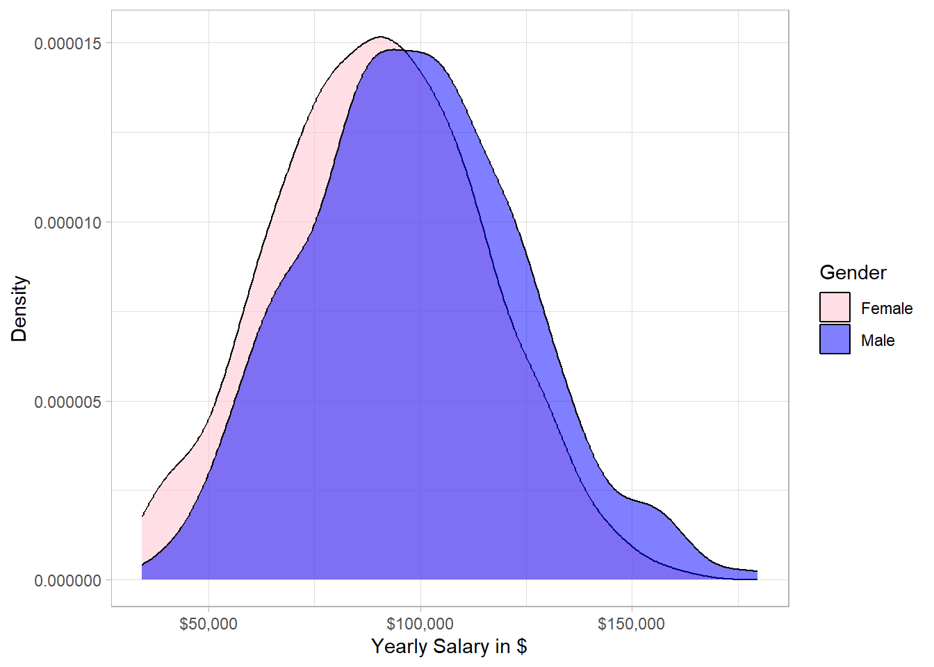
From a statistical point of view, the two distributions are similar, meaning that there is no significant difference between males and females. However, the majority of the highest salaries belongs to males. In other words, the distribution of males is slightly more concentrated on the right side compared to the distribution of females. This means that if we randomly pick one male and one female from our sample, the probability that the male has higher salary than the female is slightly more than 50%.
Now, the next question is what is the ratio of males to females within the different jobs. To visualize that, we will create a bar plot with two axes flipped:
# Job Title and Gender
dat %>%
  group_by(JobTitle) %>%
  mutate(Employees_per_Job = n()) %>%
  ungroup() %>%
  mutate(JobTitle = fct_reorder(JobTitle, Employees_per_Job)) %>%
  ggplot(aes(x = JobTitle, fill = Gender)) +
  geom_bar(position = position_dodge()) +
  scale_fill_manual(values = c("pink", "blue")) +
  coord_flip() +
  xlab("Job Title") +
  ylab("Number of Employees")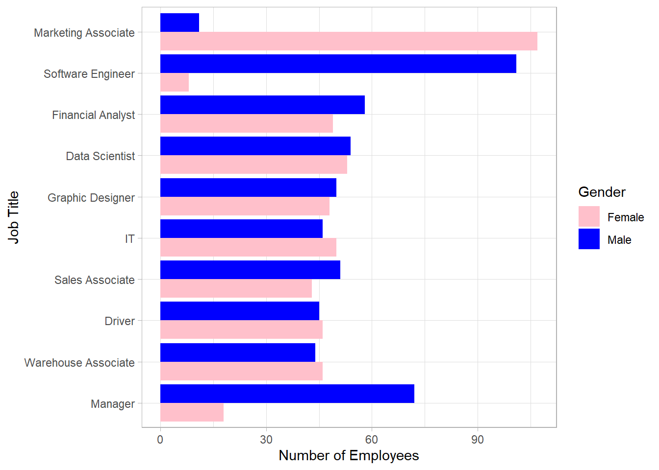
This bar plot shows very interesting insights. There is a balance within the different jobs except for “Marketing Associates”, “Software Engineers” and “Managers”. Most software engineers and managers are males while the majority of marketing associates is females. Before we make any conclusions, we need to examine the distribution of the yearly salary for each job. For this, we will create a box plot to visualize the distribution for each gender within each job:
# Job Title and Salary per Gender
dat %>%
  group_by(JobTitle) %>%
  mutate(Employees_per_Job = n()) %>%
  ungroup() %>%
  mutate(JobTitle = fct_reorder(JobTitle, Employees_per_Job)) %>%
  ggplot(aes(x = JobTitle, y = BasePay, fill = Gender)) +
  geom_boxplot() +
  scale_fill_manual(values = c("pink", "blue")) +
  coord_flip() +
  scale_y_continuous(labels = dollar_format(accuracy = 1)) +
  expand_limits(y = 0) +
  xlab("Job Title") +
  ylab("Salary Amount in $")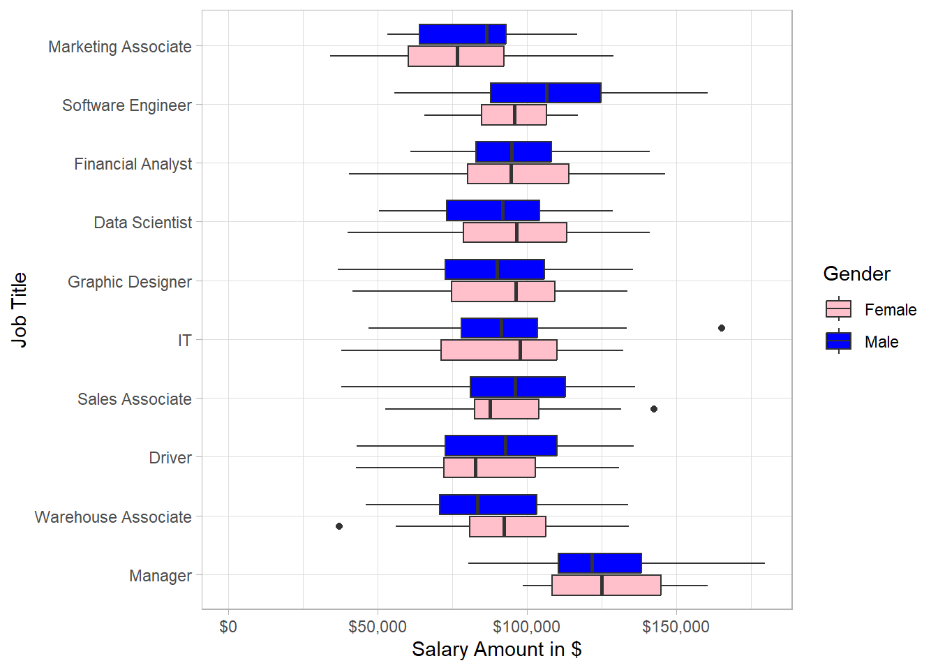
This plot reflects some great insights. Even though we saw earlier that the overall distribution of male salary is more to the right hand side, we see that there are instances such as IT for which the distribution of female salary is more to the right hand side than that of male salary. Generally, there is a high spread of salaries for both male and female employees for most of the job titles.
Combining the two latest plots, we can observe the following: although most managers are males, the median salary of female managers is very close to that of male managers. Additionally, marketing associates have the lowest salaries in general and since most of the marketing associates are females, it make sense that there are many women with relatively low salaries. Regarding data scientists, we have approximately as many female employees as male employees but female employees receive a higher salary on average than that of male employees. Lastly, there are significantly more male software engineers than female ones, with males earning a higher average salary than females.
Now, let’s explore the salary distribution within the different levels of education instead of job title. To do this, we create a similar plot as before, but now we include the education level instead of the job title on the y axis:
# Education and Salary per Gender
dat %>%
  group_by(Education) %>%
  mutate(Employees_per_Job = n()) %>%
  ungroup() %>%
  mutate(Education = fct_reorder(Education, Employees_per_Job)) %>%
  ggplot(aes(x = Education, y = BasePay, fill = Gender)) +
  geom_boxplot() +
  scale_fill_manual(values = c("pink", "blue")) +
  scale_y_log10(labels = dollar_format(accuracy = 1)) +
  coord_flip() +
  xlab("Education") +
  ylab("Salary Amount in $")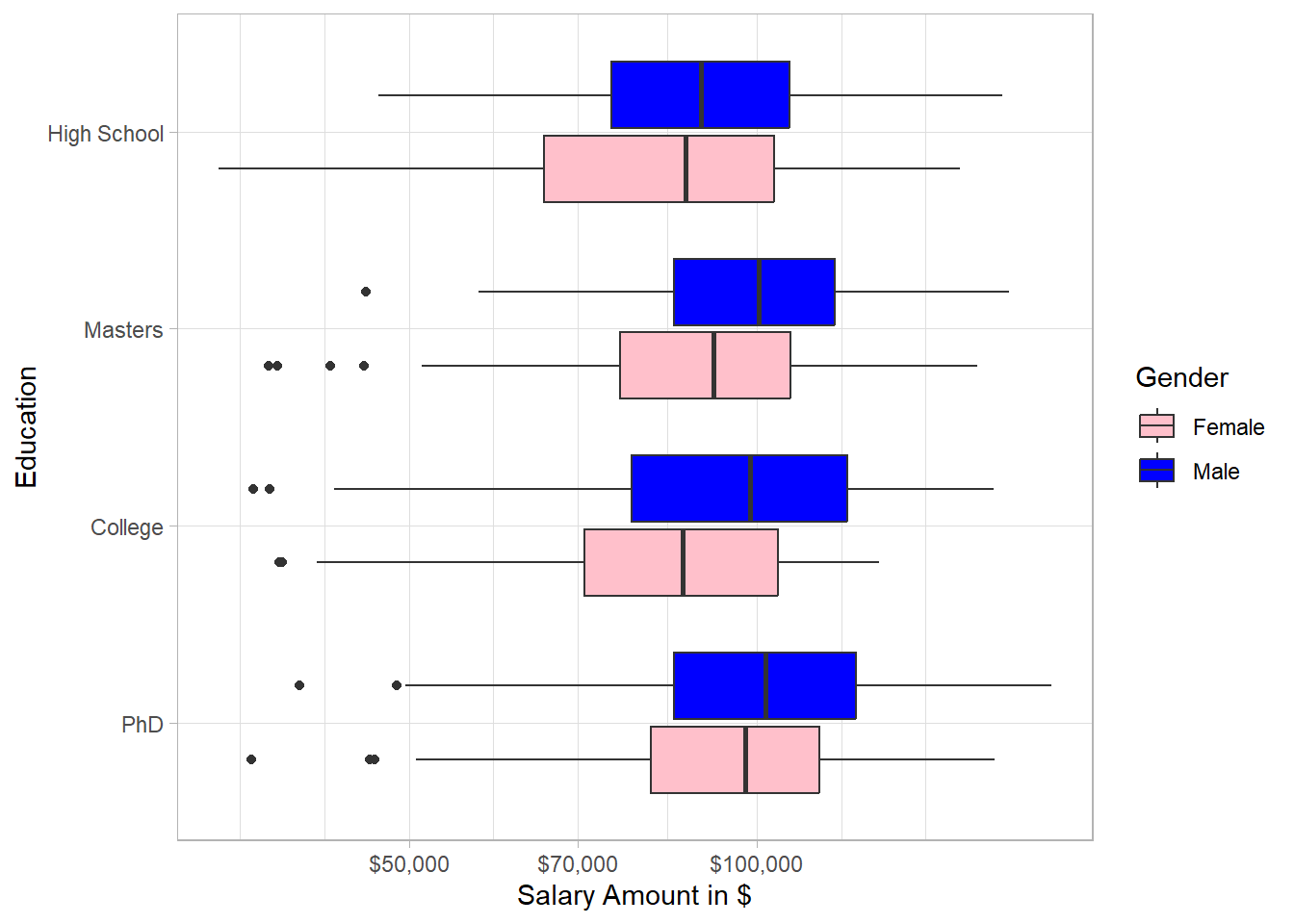
In every education level, the salary distribution of males is concentrated more on the right hand side than that of females, especially for college. Interestingly, the education in general does not seem to be associated with salary; there are many employees that earn much higher salary than employees with PhD, both for males and females.
Based on the exploratory data analysis, there is no clear pattern that women tend to get paid lower than men due to their gender. Factors such as job title seem to be mostly associated with salaries.
Statistical Inference
To make statistical inference, we use linear regression using the Ordinary Least Squares (or OLS) as our estimation method. Linear regression has the power to incorporate information of many variables to make statistical inference. In our case, we want to investigate whether there is a statistically significant difference between males and females in terms of salary while controlling for any other differences, such as level of seniority or job title. One main assumption is that our sample (data set) is seen as random, meaning that each employee from the population (U.S. employees) has equal probability to appear in our sample. In other words, we want our sample to represent the population of interest in order for any conclusions to be valid. Even though this is probably not the case with this dataset, our goal is to treat the sample as if it were random and use it as an approximation of the population. Under this assumption, OLS allows us to estimate the relationship between gender and salary while holding other relevant factors constant, and to test whether any observed differences are statistically significant rather than due to random variation.
Before we fit a linear model, it is important to state our two hypotheses. The first hypothesis is the null hypothesis (H0) which states that there is no statistically significant difference between men and women in terms of salary. The alternative hypothesis (H1) states that there is statistically significant difference between men and women in their salaries:
\(H_0: \beta_{Male} = 0\)
\(H_0: \beta_{Male} \neq 0\)
So, we estimate this beta with linear regression, while taking into account information such as job title and education. Note that we do not expect to estimate a beta exactly equal to 0 to conclude that “we cannot reject the null hypothesis”; this will almost never be the case. What we try to do is to check whether our estimated beta is statistically significant different from 0. If that is the case, then we will be able to reject the null hypothesis, meaning that we have evidence that there is statistically significant differences, either higher or lower, between males and females in terms of their yearly salary.
In our linear regression model, the variable of interest (or dependent variable) is salary (BasePay) on a log scale, and the independent variable is gender (Gender). To take into account the information of the other variables as well, we include also the rest of the variables in our linear regression model. To run linear regression, we use the lm() function. Inside this function, we use the symbol tilde (~) to separate the dependent variable from the independent ones.
# Linear Regression Model
lm_model <- lm(log(BasePay) ~ Gender +
                 JobTitle + Education +
                 PerfEval + Dept +
                 Seniority + Age +
                 Bonus,
               data = dat)
We have a created a linear regression model that includes estimates for the betas of all the independent variables. The beta that we are interested in is the one of Gender. This variable is a dummy variable, meaning that it takes only values of 0 or 1. If an employee is male, the value of Gender is 1, otherwise it is 0. To view the results, we use the function tidy() from the broom package, in combination with the summary() function, to extract the results into a data frame and then round the numbers to 3 digits. We also use pipes (%>%) from the dplyr package in order to have an efficient and easy-to-read code. Lastly, we use the kable() function to extract the results on a nice table:
# Extract the results
lm_model %>%
  summary() %>%
  tidy()%>%
  mutate_if(is.numeric, .funs = ~round(., 3)) %>%
knitr::kable()| term | estimate | std.error | statistic | p.value |
|---|---|---|---|---|
| (Intercept) | 10.561 | 0.042 | 254.431 | 0.000 |
| GenderMale | 0.010 | 0.009 | 1.087 | 0.277 |
| JobTitleDriver | -0.040 | 0.018 | -2.194 | 0.028 |
| JobTitleFinancial Analyst | 0.047 | 0.018 | 2.641 | 0.008 |
| JobTitleGraphic Designer | -0.032 | 0.018 | -1.778 | 0.076 |
| JobTitleIT | -0.028 | 0.018 | -1.539 | 0.124 |
| JobTitleManager | 0.307 | 0.018 | 16.673 | 0.000 |
| JobTitleMarketing Associate | -0.206 | 0.018 | -11.680 | 0.000 |
| JobTitleSales Associate | 0.002 | 0.018 | 0.114 | 0.909 |
| JobTitleSoftware Engineer | 0.139 | 0.018 | 7.836 | 0.000 |
| JobTitleWarehouse Associate | -0.005 | 0.018 | -0.296 | 0.768 |
| EducationHigh School | -0.016 | 0.011 | -1.446 | 0.149 |
| EducationMasters | 0.055 | 0.011 | 4.800 | 0.000 |
| EducationPhD | 0.063 | 0.012 | 5.394 | 0.000 |
| PerfEval | 0.001 | 0.010 | 0.106 | 0.915 |
| DeptEngineering | 0.031 | 0.013 | 2.352 | 0.019 |
| DeptManagement | 0.033 | 0.013 | 2.494 | 0.013 |
| DeptOperations | -0.002 | 0.013 | -0.152 | 0.879 |
| DeptSales | 0.069 | 0.013 | 5.432 | 0.000 |
| Seniority | 0.109 | 0.004 | 30.194 | 0.000 |
| Age | 0.011 | 0.000 | 23.162 | 0.000 |
| Bonus | 0.000 | 0.000 | -0.109 | 0.913 |
Although this table shows many numbers, the row of interest is the second row. In that row, we have the term GenderMale, which reflects the beta (estimate) of the variable Gender. This beta reflects the average salary difference between males and females, holding other factors fixed. Specifically, since the estimate of the term GenderMale is positive, males receive a higher salary than females on average, something that we actually saw in the first plot. The interpretation of this beta is the following: male employees receive 1% (we multiply the estimate by 100 to see the percentage difference) higher salary on average than female ones holding other factors fixed; we consider that this difference is associated to the gender since this is what we model in the first place. Our main question though is whether this average difference is (statistically) significant different from 0; a difference of approximately 1% may not be a huge difference after all.
Therefore, even though the estimate is higher than 0, the p-value (last column) is the value that can clarify whether the estimate is statistically significant different from 0. To reject the null hypothesis, we set the threshold to 0.05, meaning that if the p-value is below 0.05, then we reject the null hypothesis.
# Extract the results for gender
lm_model %>%
  summary() %>%
  tidy() %>%
  mutate_if(is.numeric, .funs = ~round(., 3)) %>%
  slice(2) %>%
knitr::kable()| term | estimate | std.error | statistic | p.value |
|---|---|---|---|---|
| GenderMale | 0.01 | 0.009 | 1.087 | 0.277 |
The p-value of the coefficient GenderMale is above 0.05, meaning that we cannot reject the null hypothesis that states that there is no statistically significant difference in salary between male and female employees. In other words, we lack evidence to conclude that the salaries between males and females differ significantly, holding other factors, such as job title, fixed.
To make sure this p-value is valid though, we need to make sure that the homoskedasticity assumption is valid. In plain English, we assume the variance (or spread) of the errors does not depend on some levels of the independent variable. To put it differently, the spread that we have among the observations should be stable. For example, we assume that the spread in salary is similar for Marketing Associates and Data Scientists.
Thankfully, the Breusch-Pagan test can help us to check whether this assumption holds. We simply take the residuals of the models, square them and then run the same linear regression, with the difference that now the dependent variable is the squared residuals instead of salary (BasePay). If the homoskedasticity assumption holds, then the p-value of overall significance (the p-value for all the variables combined) is insignificant. In other words, the independent variables are not associated with those residuals, which is what we assume with homoskedasticity in the first place. With the following code, we follow this process and create an object variability_type to print whether we have homoskedasticity or heteroskedasticity:
# Breusch-Pagan Test for Heteroskedasticity

## Extract residuals and square them
model_residuals <- (summary(lm_model)$residual)^2

## Regress squared residuals on the independent variables
BP_test <- lm(model_residuals ~ Gender + JobTitle +
                           Education + PerfEval +
                           Dept + Seniority +
                           Age + Bonus, data = dat)

## Conclude whether there is homoskedasticity or heteroskedasticity
if(glance(BP_test)$p.value >= 0.05) {
  variability_type <- "Homoskedasticity"
} else {
  variability_type <- "Heteroskedasticity"
}

# Print Conclusion
print(variability_type)
[1] "Heteroskedasticity"Based on the Breusch-Pagan test, the homoskedasticity assumption is NOT valid, meaning that we need to use heteroskedastic-robust standard errors for the calculation of the p-value. Even though this may sound complicated, we simply use the coeftest() function from the lmtest package in combination with the vcovHC() function from the sandwich package. The following code shows exactly how to get the output we need :
# Libraries
library(sandwich)
library(lmtest)

# Extract the results - Heteroskedastic-robust standard errors
lm_model %>%
  coeftest(vcov. = vcovHC(lm_model, type = "HC1")) %>%
  tidy() %>%
  mutate_if(is.numeric, .funs = ~round(., 3)) %>%
knitr::kable()| term | estimate | std.error | statistic | p.value |
|---|---|---|---|---|
| (Intercept) | 10.561 | 0.043 | 246.206 | 0.000 |
| GenderMale | 0.010 | 0.009 | 1.090 | 0.276 |
| JobTitleDriver | -0.040 | 0.018 | -2.198 | 0.028 |
| JobTitleFinancial Analyst | 0.047 | 0.018 | 2.617 | 0.009 |
| JobTitleGraphic Designer | -0.032 | 0.018 | -1.728 | 0.084 |
| JobTitleIT | -0.028 | 0.019 | -1.479 | 0.140 |
| JobTitleManager | 0.307 | 0.016 | 18.841 | 0.000 |
| JobTitleMarketing Associate | -0.206 | 0.019 | -10.763 | 0.000 |
| JobTitleSales Associate | 0.002 | 0.018 | 0.116 | 0.908 |
| JobTitleSoftware Engineer | 0.139 | 0.016 | 8.452 | 0.000 |
| JobTitleWarehouse Associate | -0.005 | 0.018 | -0.303 | 0.762 |
| EducationHigh School | -0.016 | 0.012 | -1.372 | 0.170 |
| EducationMasters | 0.055 | 0.012 | 4.591 | 0.000 |
| EducationPhD | 0.063 | 0.012 | 5.267 | 0.000 |
| PerfEval | 0.001 | 0.010 | 0.105 | 0.916 |
| DeptEngineering | 0.031 | 0.013 | 2.325 | 0.020 |
| DeptManagement | 0.033 | 0.013 | 2.427 | 0.015 |
| DeptOperations | -0.002 | 0.014 | -0.140 | 0.888 |
| DeptSales | 0.069 | 0.013 | 5.298 | 0.000 |
| Seniority | 0.109 | 0.004 | 28.579 | 0.000 |
| Age | 0.011 | 0.000 | 22.860 | 0.000 |
| Bonus | 0.000 | 0.000 | -0.110 | 0.913 |
The values in the first two columns are exactly the same. The values in the other three columns differ because we take into account the heteroskedasticity that we detected. For this reason, the standard errors (std.error), the t-statistics (statistic) and the p-values (p.value) are re-calculated. However, we are still only interested in the p-value of the variable GenderMale. The p-value is almost the same as previously, meaning that our conclusion does not change: there is no statistically significant difference in salary between male and female employees, holding other factors fixed.
Conclusions
Our conclusion is that, based on our sample, we do not have any evidence to conclude that female employees get paid significantly different from male employees due to their gender. Although the employees with the highest salaries are mostly males, we tested whether on average male employees receive higher salary than female employees holding other factors fixed. We have to remember though that our assumption is that our sample is random, which means that we hope that our sample clearly represents the population in the professions that we saw.
Before we finalize this case study, we present the code that can print the conclusion results automatically:
# Libraries
library(readr)
library(dplyr)
library(broom)
library(lmtest)
library(sandwich)

# Read csv file
dat <- read_csv("https://raw.githubusercontent.com/GeorgeOrfanos/Data-Sets/refs/heads/main/gender_pay_gap.csv")

# Linear Regression Model
model <- lm(BasePay ~ ., data = dat)

# Breusch-Pagan Test for Heteroskedasticity

## Extract residuals and square them
model_residuals <- (summary(model)$residual)^2

## Regress squared residuals on the independent variables
BP_test <- lm(model_residuals ~ .,
              data = dat %>%
                select(-BasePay))

## Conclude whether there is homoskedasticity or heteroskedasticity
variance_assumption <- ifelse(glance(BP_test)$p.value >= 0.05,
                              "Homoskedasticity",
                              "Heteroskedasticity")

# Print variability_type based on linear regression model
if(variance_assumption == "Homoskedasticity"){
  model <- lm(model_residuals ~ ., data = dat)

  gender_coeff <- model %>%
    summary() %>%
    tidy() %>%
    filter(term == "GenderMale")

  if(gender_coeff$p.value < 0.05) {
    variability_type <- "Statistically significant difference"
  } else {
      variability_type <- "No statistically significant difference"
      }
  } else {
    model <- lm(model_residuals ~ ., data = dat)

    gender_coeff <- coeftest(model, vcov=vcovHC(model, type = "HC0")) %>%
      tidy() %>%
      filter(term == "GenderMale")

    if(gender_coeff$p.value < 0.05){
    variability_type <-  "Statistically significant difference"
    } else {
    variability_type <- "No statistically significant difference"}
  }
# Print variability_type
print(variability_type)[1] "No statistically significant difference"By executing this code, we see that we print the same conclusions automatically. In our analysis, we conclude that there is no statistically significant difference between males and females in terms of salary, holding other factors fixed.